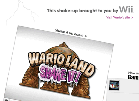
A Full Screen Web Advert That Works
I spend all day glued to a laptop, much of it browser-based. Not many advertisers manage to cut through the clutter with an ad that grabs the eye, holds the attention and gets the message across. And how rare is that?
I store special hatred for those annoying rich media ads. You know the ones, an accidental scroll of the mouse across their annoying hot spots and they expand over the content you originally wanted to see. If they have an X to close the ad, it’s near-impossible to see or is so small you the steady hand of brain surgeon to close the damn thing.
Well, for the first time in ages, I watched an online animated advert all the way through to the end, thanks to the Twitter friends who pointed this as for the new Wario Land game on the Nintendo Wii:
I’ve seen something similar before, but can’t for the life of me remember which brand it was. If you can remember, leave a comment below, I’d love to know.
And if you like that sort of thing, I suspect the creatives that came up with this ad owe a not inconsiderable debt to Alan Becker, who created the now famous Animator vs Animation movies in 2006.
Animator vs. Animation
Animator vs Animation Part 2


